WeCommunities tweeting bird logos have been instantly recognisable and have served us all well for the last 10 exciting years, but I wonder how many people know the history of our friendly-looking birds?
“Little Chirp,” as the bird was affectionately dubbed by Pam Nelmes, was created hastily one evening for our founder Teresa Chinn MBE RN by the then amazing "WeIT guy" Nick, now We CEO, and with the concept that the bird was a newly hatched Twitter egg (originally for those without profile pictures on a Twitter where an egg would be the default image, the egg was dropped by Twitter in March 2017.)
The logo took key features of the community each bird represented to make it obvious who the community was for….so for the first community - nurses - a nurses hat was chosen.
We were asked by the Red Cross to remove the red cross in chirp's hat back in 2019, the red cross emblem is restricted under the Geneva Conventions for the Protection of War Victims of 12 August 1949; unauthorised use of this sign in the United Kingdom is an offence under the Geneva Conventions Act 1957. Every day is a school day, so of course, we obliged and Chirp lost the cross.

Little Chirp - thanks for a great 10 years!
Little Chirp has sat on all of the WeCommunities Twitter avatars for 10 years now and whilst he (as often referred to as male) has done an amazing job it’s well past time for a change and for more than a few reasons.
With WeCommunities 10th Birthday coming up on July 4th it’s a good time to regroup and rethink who ‘We’ are.
We have had many comments, both good and bad, over the 10 years about our avatars, particularly the WeNurses avatar and over this time we have taken note of people's thoughts and points.
So much has changed in health and care, in social media, and the world over those 10 years … everything has evolved. However, as a small organisation it’s difficult to make such a huge change as your logo and outward identity, not only due to cost implications but also the time it takes, the risk that people won’t like the change and the logistics of having one small thing affect so much. The bottom line is though that we have to progress and move forward.
Here’s where I need you to imagine a big ‘Taaaa dahhhhh !!” and perhaps some streamers and fireworks dear reader …. Because here are some of the new WeCommunities logos …..

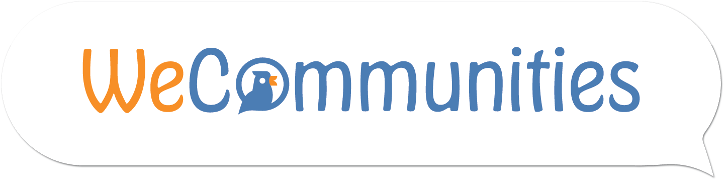
It’s hard not to notice a good few differences: Firstly the birds, who have been retained given Twitter's huge part of what We do, have no hats, watches, clothing, stethoscopes or other items as we made the decision to move away from stereotypes in health and care. Many roles are growing and evolving and it’s important we reflect this.
The birds are gender-neutral - we have moved away from any implied gender in our logo and made it much more inclusive and representative of the people working in health and care.
The birds form part of a speech bubble (did you spot it) as talking on Twitter is the heart of what ‘We’ do. Communication forms the basis of supporting each other, learning, sharing, and growing. As an organisation talking to you all and listening to what you have to say, from students to Chief Execs, every day, here on Twitter is hugely unique to WeCommunities, something that no other organisation does as its sole function. We are really proud that as we say goodbye, and thank you, to Little Chirp we have an image that much more closely represents the what and why of WeCommunities, and importantly where we hope to take you too; more news on this soon.
Whilst Little Chirp was always received in a very friendly and congenial way, as the communities amazingly began to grow in size, respect, and influence, we began to feel Little Chirp did not represent the professionalism, skill, and integrity that you as healthcare professionals deserved to be represented by. We now feel that this modern, clean and more representative look is much more fitting; thank you to those we consulted along the way and who helped us get here.
The birds are a range of colours represented across the communities - this represents diversity in health and care, which is something we are hugely passionate about. We feel that this change is a positive move forward and is more representative of the 300,000 plus followers of the communities that tweet throughout health and care; In essence, we hope that you love our new logos as much as we do.
We worked closely and were well supported by Momentum Design who understood how precious our communities are to us but have given us the confidence to take the communities forward with a new, modern confident, and professional feel; for that we thank them for working with us.
You'll see your new branding appearing on the accounts very soon.
And finally, thanks Little Chirp, you've been great, but now is a good time to set you free.
|
@{{Comment.screenName}}
{{Comment.DateCreated | date:"dd MMMM yyyy HH:mm"}}
|
{{Comment.Comment}} | |
|
@PhilBallRN
29 April 2022 06:09
|
This change is so positive, a great idea and worth supporting. It’s typical of the creative approach the #WeCommunities have, making it such a success. Here’s to another 10 years , then 10 more and so on ?? |